What the research says about font pairing
Every designer has an opinion about mixing fonts. Never use more than two typefaces. Always pair a serif with a sans-serif. Serif is for trust, sans-serif is for modernity. Most of this advice gets repeated so often that it starts to sound like fact, but very little of it started as research. It started as taste, passed down until it sort of hardened into a “rule.”
That's not a knock on taste. Design intuition is real and it's earned. But if you're building a brand system, it helps to know which parts of the "rules" are backed by evidence, which parts are contested, and which parts are just aesthetic preference. Here's what the actual research shows.
Contrast matters most
In 2024, researchers Jiin Choi and Kyung Hoon Hyun published a large-scale study in Scientific Reports analyzing thousands of real-world font-use cases to figure out what actually makes a pairing work. Instead of relying on designer intuition, they broke typefaces down into three measurable traits: serif versus sans-serif, basic versus decorative, and light versus bold. Then they compared real pairings against random ones to see what separated the two.
The finding: successful pairings were defined by contrast. That means regardless of what the body and header fonts are, the important thing is that they’re different enough to be immediately obvious.
In other words, the mechanism isn't "mix families." It's "create enough visual difference that the eye can tell the two fonts apart, without so much difference that the pairing looks accidental." That’s it. That’s the closest thing typography has to a consistent finding across studies.
The serif vs sans-serif readability debate
The idea that serif fonts are better for print and sans-serif fonts are better for screens goes back decades, and it isn't baseless. Early research on low-resolution screens did find sans-serif fonts held up better under those conditions. But newer studies complicate the story considerably. A 2021 eye-tracking comparison found no significant difference in reading speed or accuracy between serif and sans-serif fonts on screen.
Screen resolution turns out to be a major hidden variable. As displays improved, several of the "sans-serif wins on screen" findings stopped replicating.
The honest summary: readability differences between well-designed serif and sans-serif fonts are usually small enough that other factors, like line length, size, spacing, and screen quality, matter more than the presence or absence of a serif.
What this means for building a brand visual system
Pair for contrast, not category. The research suggests the real mechanism behind a good pairing is measurable difference in weight, structure, or ornamentation, not a rigid serif/sans-serif requirement. Two sans-serifs with enough contrast in weight and character can work. Two serifs can too, if they're different enough in structure.
Don't treat readability as settled science. If someone tells you sans-serif is objectively more readable, that claim doesn't hold up as cleanly as it used to. Test your actual audience, actual device, and actual context instead of applying a rule that was built on 20-year-old screen technology.
Choose typefaces for the signal, not just the function. Since perception research is more consistent than legibility research, the more useful question is usually not "which font is easier to read" but "which font matches the tone I want this brand to carry before anyone reads a word." A nonprofit signaling stability and legacy has a different answer than a startup signaling speed and accessibility, even if both fonts are equally legible.
Font pairing isn't a gut call and it isn't pure science either. It's closer to what most of brand strategy actually is: a set of psychological tendencies, applied with judgment, tested against a real audience instead of a personal preference.
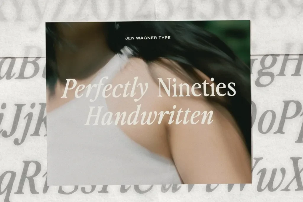
Where I source my fonts
If you're ready to put any of this into practice, the typeface itself still matters, and that's the part research can't do for you. You need fonts with enough craft in the letterforms to earn the contrast we just talked about.
Jen Wagner is the type designer I go back to for that. Her fonts (Perfectly Nineties is the one I use for my own brand) have the kind of character and detail that make brands really stand out, regardless of how they are paired.
Grab 15% off anything in her shop with my code COVEN15.