Some typefaces are just letters. Others practically hum with nostalgia the second you type them.
If you’re creating a brand, blog, or content series that leans into vintage, bold, or 90s editorial inspired visuals, having the right font is like finding the perfect thrift store gem. It sets the tone before you ever say a word.
Below are a few of my favorite nostalgic fonts from Jen Wagner — a designer I’ve followed and admired for years. These are affiliate links, which means I will earn a small commission if you make a purchase, at no cost to you. (Actually, you can get a discount if you use code COVEN15) But I wouldn’t recommend anything I wouldn’t use myself, and indeed, I’ve used several of these for past projects. I’m proud to recommend them.
Perfectly Nineties Serif Family
This one is giving early Vogue meets Delia’s catalog.
It’s the perfect blend of elevated and playful, with 10 styles in one family so you can mix and match for all mediums without overthinking it. Great for personal brands, lifestyle creators, or anyone wanting to walk the line between retro and refined.

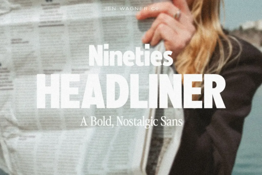
Nineties Headliner
I own this font and I LOVE LOVE LOVE it. It’s so editorial. This was made for making a statement — ideal for headers, social posts, and mood boards where you want the font to do the heavy lifting.
Sailing Club
This is a longtime favorite of Jen’s. I actually used Sailing Club for the materials I used in my wedding. This font feels a little collegiate, a little vintage prep, and somehow totally modern. A beautiful choice for brands that want to nod to the past without being stuck in it.

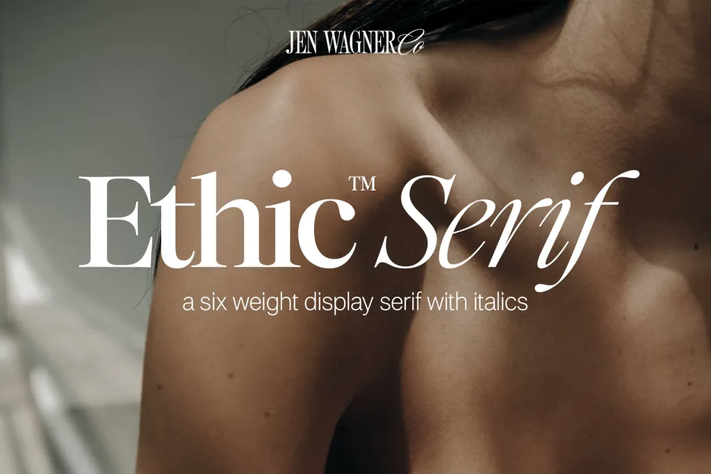
Ethic Serif
Technically, this one doesn’t give vintage nineties, it’s more timeless, but I’m sneaking it onto this list because it plays well with nostalgic vibes. I especially love the italic weight in this. It reminds me of old school newspapers and hand cut collages.
Why fonts like these matter
When you’re building a visual brand, font choice is one of the first crucial first impressions your audience will make. When you’re tapping into a niche or aesthetic, like retro or nostalgia, the wrong font can throw everything off. These fonts anchor your brand in a particular feeling. They’re visual shorthand for a whole vibe.
Want more tips on building your brand’s visuals in a way that feels spot on and uniquely you? Check out my brand workbook.